
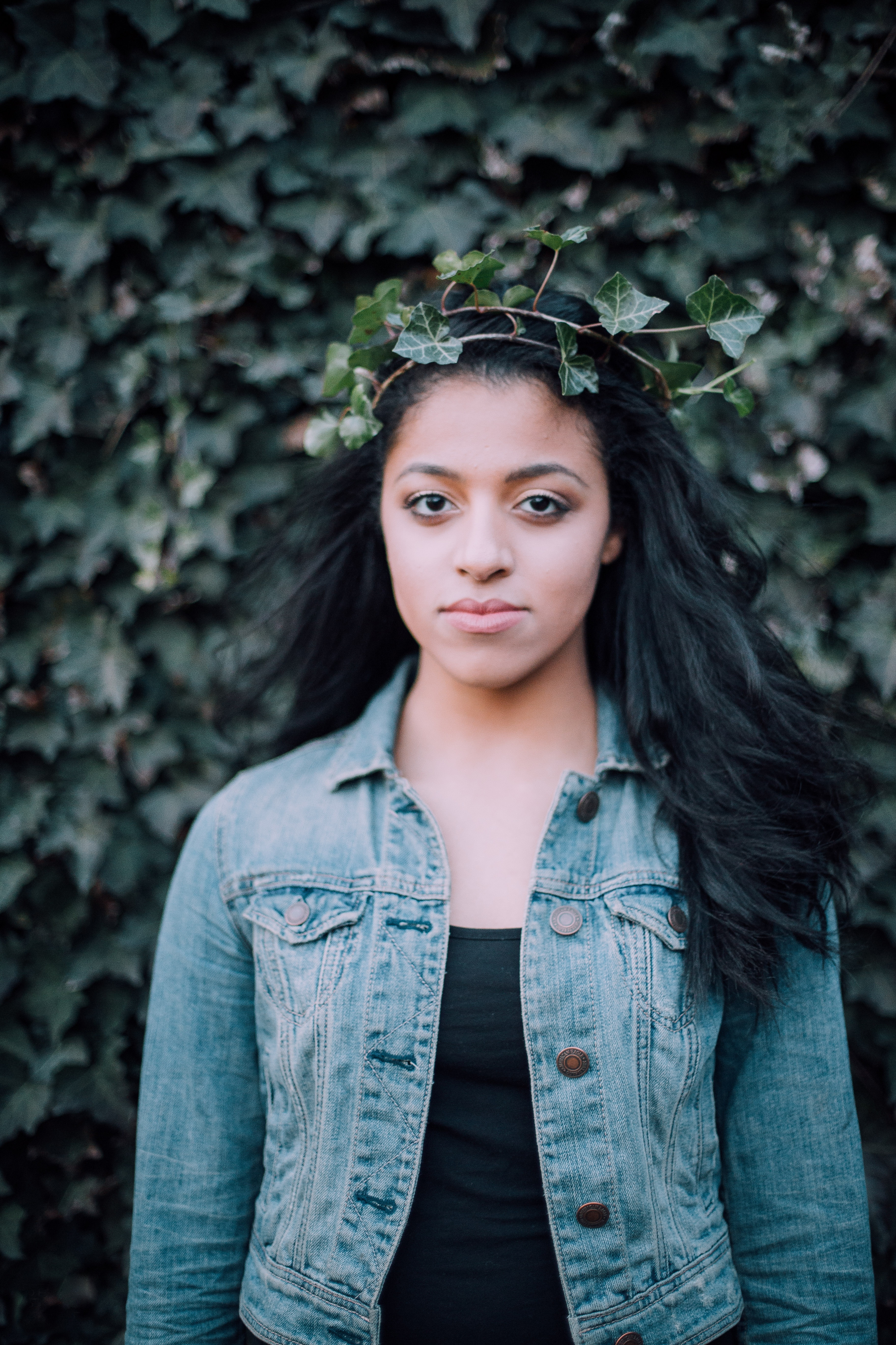
This is a template I created to showcase some of my photos in a photo book at the end of the semester. I took three of the pictures and edited the contrast and vibrance. The other three photos are public domain photos from the website unsplash.com.
I found a font I liked for the headings titled Incredible Angel and a nice sans serif font for my paragraph called Kannada MN. I laid out the images a few different ways before I decided on a layout. I also added the swirl to add unity and an element of design.
Thumbnails of images from unsplash.com:


Great work. I love the yellow on black! I also thought it was cool how you overlapped the pictures on your first page. Great layout, awesome font choice–awesome job! Here’s mine:
https://chrisbazzleblog.wordpress.com/2016/01/13/photobook-2/
LikeLike
THis design puts mine to shame. I love discovering the techniques of others o I can improcve my own work. Your Desing is elegant and shows off your personality. I personally made a layout that is not even simple it is just bad. I really hope you continue to design what is you and not conform to the ideals of another.
https://comm300site.wordpress.com/
https://www.facebook.com/The15awesomenow/?ref=aymt_homepage_panel
LikeLike
Esther, I love how you have arranged your photo book. I especially love how you have arranged the portraits page as it has beautiful hierarchy among the images and text. I also love how you have the unity and repetition going with the little swirl design on the pages. I think that this layout will be beautiful if you chose to use it in your final layout. Great job and I can’t wait to see more. You can view my layout here: https://jalenesphotography.wordpress.com/2016/01/13/photobook-design/ and Ethan’s here: https://cinemaphotographyblog.wordpress.com/2016/01/13/tis-the-season/
LikeLike
Esther, I really like your photo book layout and especially the photos you chose to use in this project. I like the way the photos line up as well as the white space used. Keep up the great work! I’m excited to see what lies ahead!
Check out my own post:
https://markpauldaniel.wordpress.com/2016/01/12/photo-book-layout/
LikeLike
Your photo book is one of my favorite because your pictures have good color to them. The contrast is also done very well. The way the subjects are placed gives it a professional look. The background also allows the images to push forward and grab the audiences attention.
https://cinemaphotographyblog.wordpress.com/2016/01/13/tis-the-season/
LikeLike
the top left one reminds me of this site. http://vaughnsphotoart.blogspot.com/2008_08_01_archive.html
You should also check out https://haddenben.wordpress.com/2016/01/13/photo-book-activity/
LikeLike
Esther! You always have amazed me with your designs in the last class we had together. I can’t wait to see more of your work this semester. Keep up the awesome work!
Check out my site here: https://tenneyphotos.wordpress.com/2016/01/13/photobook-design/
Check out Paige’s site here: https://paigebrowncomm.wordpress.com/2016/01/13/photobook-design/
LikeLike
I really liked your images. Especially the one with the rose. I don’t always like when things are centered in the image, but I do like how the rose is centered in this one. There is just something magical about it.
I like how the right side of your phonebook laid out, but not so much the right side. I would suggest making it more similar to the right side.
You can check mine out at https://samsargeantportfolio.wordpress.com/2016/01/13/photobook-2-page-spread/.
You can also check these out. https://blakeclement.wordpress.com/2016/01/13/photobook-design/
And if your looking for some inspiration for the semester, Chase Jarvis is killer. http://www.chasejarvis.com/#mi=1&pt=0&pi=2&p=-1&a=-1&at=0
LikeLike
Esther,
I really like your layout here. I also really like the curving yellow line I feel like it really helps the overall flow of the photo book.I also really like the photo placement. Overall it looks great, thanks for sharing your talent with us.
Come check out my photo book @ https://haddenben.wordpress.com/2016/01/13/photo-book-activity/
LikeLike
You did a great job on the photobook design Esther! I love the right page and the spacing between each picture. It almost gives each one a frame around them. The font and color work really well and it is easy to read. Great job! Here is link to my photobook design. https://kalincraynor.wordpress.com/2016/01/13/photobook-design/
LikeLike